Showing posts with label Google. Show all posts

Tuesday, 5 August 2014

Is Google Material the future "stuff" of mobile?


Google has recently launched, if that is the right word, their new unified UI. It is named Material  Design and has made big waves in the UX and design communities. When it arrives on commercial products end users will be able to experience this new approach to user interfaces.


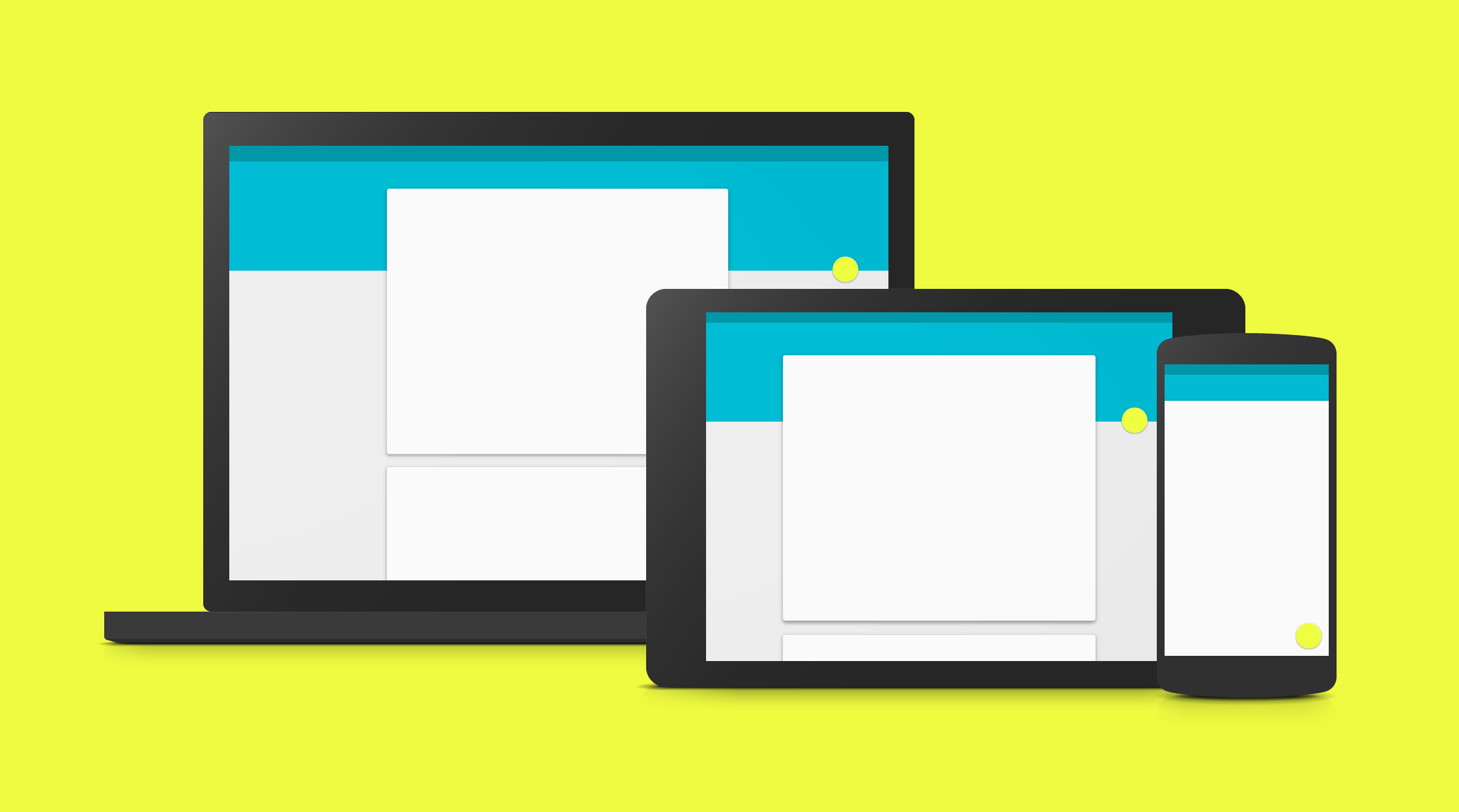
Develop a single underlying system that allows for a unified experience across platforms and device sizes. Mobile precepts are fundamental, but touch, voice, mouse, and keyboard are all first-class input methods.


So consitancy is a core principle, lets come back to this later.

The inspiration, or foundation material is paper and ink:

The material is grounded in tactile reality, inspired by the study of paper and ink, yet technologically advanced and open to imagination and magic.


John Wiley, one of the Principle Designers at Google, gave this insight about how Material Design cameabout:
I'm one of the instigators of material design. It actually came about a couple of years ago when we were working on a design problem involving Google Search. I was looking at mobile results on cards and I asked "what is this made of?" People gave me funny looks, like "what do you mean? It's just pixels." But I didn't think that was a good answer.
When you physically interact with software – actually touching the cards and links and buttons, etc. – you bring a lot of expectations around how physical objects behave. If the interface isn't thoughtful about those expectations – if it's just a bunch of pixels – it leaves you with a rather unsatisfying and inauthentic experience.


The key point is “what is this made of?” . We spend hours staring at and prodding and swiping this stuff but what is it? A good question.

Material Design is the work of a design team, whose heritage and inspiration is the 2.5D world of layers of paper. It is graphic design minimalism applied to digital design and is a direct response to and rejection of the skumorphic design which typified the first few iterations of the Apple mobile IOS. Skumorphisim grew to be seen as an over ornate and decorative form of UI design. A gothic form of UI design. Its attempts to literally ape the physical appearances of the core analog devices indicative of an application’s function became to be viewed as excessive and unnecessarily visually complex.

We need to take a few steps back to understand the initial rational for skumophic design.  Skumorphic design is a visual imitation  of another object by replicating its visual form, shape and functionality. Lets start by looking at the two worlds, that of the being presented to the viewer in one form or an other and the world of experiences, memories and cultural inheritance of the user. As Don Norman putsit :

In the world of design, what matters is:
1.    If the desired controls can be perceived
1.a. In an easy to use design, if they can both readily be perceived and interpreted
  1. If the desired actions can be discovered
    2.a. Whether standard conventions are obeyed

When a design borrows from or copies aspects which make it easier to perceive its function then it helps the user to match their model of how the system will behave to the actual system model. This borrowing form the established norms of a previous medium or cultural experience is not unique to the computer user interface.

Often when a new form or medium appears the creators seek an appropriate reference point or model upon which to build the new way forward. They learn from the past. When Guttenberg created the first movable type he chose a typeface which mimicked the gothic script of hand produced bibles.

Detail from the Guttenberg bible

A page In order to achieve a look which mimicked the hand manuscript his typeface, Blackletter, had over 300 characters to accommodate the many ligatures and flourishes of the then traditional model.  Although his method of production was revolutionary Guttenberg employed the established aesthetic, he was using a new technology to improve the production of books but was sticking with the understood and expected visual appearance. Partly for commercial reasons, but also because that was what he and his audience knew and expected.

The first moving pictures with a constructed narrative were modeled on the experience of watching a theatre performance. The camera was static and contained none of the techniques we now expect, pans, close ups, cuts etc. It was only later that film developed a language of its own.


The revolutionary Windows, Icons, Mouse, Pointer, user interface developed by Xerox took the existing office desktop as its central metaphor. The environment where these new desktop computers were to be used was in a paper based office environment. WIMP desktop UI is still the default model for PCs Laptops etc.

When Apple sought to enter the smartphone market it was clear the WIMP and desktop metaphor was not applicable. They retained the notion of icons and buttons which were touched instead of clicked, but did away with windows and a pointer. The notion of files was now hidden from the user and the limitations of screen size meant windows were infeasible. Instead of using a consistent model across the system screens and all applications, each Apple app was designed to express the functionality it provided by mimicking its analog equivalent. Its hard to remember but making a tablet work for users was an unsolved problem until the iPad came along. Others had failed and, one of the reasons Apple did succeed was to do with making it unlike a computer. Skumorphism was a big element in this.


Skumorphic designs were employed to help users understand the capabilities of the new mobile computing platform. Buttons were given visual clues, highlights and shadows to give a 3D appearance and lift them off the screen. Functional areas which required users to touch were given clear boundaries.


Where there was no real world analogy which could be readily employed, or widely understood by the audience, then a new visual language should have been applied. This was the case in most elements of the actual system level of the iOS UI but not so with some of the Apple apps. While it makes sense to mimic a calculator or a note pad, a feature such as “find my friends” has no real world equivalent.


I would argue that for this new medium a skumorphic approach made good commercial and usability sense. The stuff that the early iOS UIs were made of was, in the case of applications, the stuff the users already knew, and in the case of system level interface items it was buttons, switches and sliders and established concepts such as dialog boxes. What failed was the need to acknowledge that not every application needs to be skumorphic and those without analog equivalents, or where slavish mimicry hindered usability, a different design approach was needed.


A new language for a new medium


Google’s Material world is an attempt to move beyond the previous medium and to create a new digital language which is appropriate to the new mobile digital world. The argument is that the user base understands how to interact with mobile technology and the skumorphic approaches of the past are no longer necessary or desirable.

I question the universality of a paper based metaphor, but the looseness of its definition means it should be adaptable to many different circumstances. I am concerned that the dominance of a minimalism aesthetic may result in throw the baby out with the bath water. The affordances and cultural heritage which gave skumorphic designs their validity and could be used to the user's benefit. But they are removed from the new language and users will need to take a greater leap to learn how to work this new stuff. This is always the case as a medium develops and the benefits of a truly digital language should out weight what is lost.

However the primary aim of establishing a consistent experience across different mobile platforms is welcome, but harder to achieve. In terms of the OS level, it is within Google’s power to at least deliver consistency within non-forked versions. When it comes to 3rd party applications the problems are much harder.

Consistency is a cornerstone of user good human computer interaction. It provides users with a stable predictable environment where things happen as they expect. Items are in the same locations. Visual symbols have the same meaning regardless of the application they are used in etc.


Today achieving consistency is much harder than it has ever been. For a while Apple achieved this for their desktop environment. Early 3rd party applications for the first few iterations of the desktop OS, had a somewhat cavalier approach to consistency. Application developers ignored many of the Apple Interface Guidelines. Finding items in menus on some early packages was a pot luck affair. Over time the (much smaller ) development community appreciated the benefits of consisteny over the need to be unique and the consistency of the Apple environment became one of its strongest assets. While there were notable exceptions such as Kai Krause most Apple applications were easy to switch between.

Then the CD-ROM era and subsequently the web created a free for all development environment where anything went. While this was good for experimentation and innovation, consistency went out the window. With millions of developers and no agreed set of guiding principles or unifying force, consistent patterns and behaviors have only been adopted through mimicry, conservatism, and recognition of the benefits of following best practice.

The same is true for mobile applications. Many iOS and Android developers embraced skumorphism, others experimented with new ways of delivering content and functionality within a touch environment. As Apple has found even with its much stricter policing of the distribution process, imposing a consistent UI experience across all apps is very hard.


Google will show case Material Design with Gmail and its core apps. I have no doubt that these will be visually stunning. Some of the biggest names in the app ecosystem will readily adopt it. The appetite for a shift away from skumorphism is widespread in the design community. However, the example of Windows 8’s touch tiled UI demonstrates that while it is visually appreciated by designers, not all applications fulfill its potential. In the case of Material the design guidelines are a beautiful expression of its capabilities, we will have to see if this new material will be the unifying aesthetic of Android experiences.

Thursday, 12 June 2014

The internet of me


There is an old gag that on leaving the house a man makes the sign of the cross. He is not religious, it stands for: spectacles, testicles, wallet, watch. A quick check to see they have all the essentials items a man needs to be a man.

Today’s version would have to include the phone. It is far more vital to our daily existence than any of the others. In fact increasingly we are now leaving home with a digital ecosystem which defines what it is to be a digital citizen. Each item no longer exists in isolation. Our smartphones are the key, the hub for all our new devices and has the potential to replace at least one of them, the wallet.  This trend will only continue.

As we adopt wearables we move from having a single digital device to a collection of independent but symbiotic internet devices. Our wristbands and smart watches can act as information conduits but also collect data, and feed it back to our smartphone. They will assess our health and wellbeing. Some of the work in deciding what to do with the data will take place on the device but most will be done on our smartphone apps talking to external health databases and where appropriate to our health providers and insurers.

Smart glasses will augment our experiences, again using the smartphone as the conduit to the external data sources. Image recognition, location services, pricing comparison, social communication will all travel through the smartphone hub to our personal internet of devices.

A lot of the time this will result in automatous actions that do not require input from the owner. Where you are, your schedule, your habits, your diary, your needs will be assessed to make decisions on your behalf. Within your own ecosystem of physical devices and the wider personal information stored in countless cloud services rules will run and instructions will be sent out.

While we are still awaiting the impact of the Internet of Things we are starting to see the Internet of Me. A world where devices are networking and making decisions for my benefit. Based on my very personal needs and state. The internet of me means the power of my network of devices is greater than of them individually.  If a new device comes along or I upgrade my health monitoring device then the other devices in the network could have access to this new data and functionality. The combination of the data from more personal sources makes the decisions which can be made more accurate, wider reaching etc.

Google always have, and recently Apple have been opening out their platforms so that third parties can  build solutions that will easily communicate and co-operate. For the time being we have to be in one or the other camp, but device makers will profit from supporting both. The added capabilities and ease of collaboration will determine what is capable on each platform.

Commercially it will open a whole new market, where tomorrow’s Apples and Facebooks will be born. Certain device combinations will hit the sweet spot and deliver killer apps. A man will not be judged by the cut of his suit but the configuration of his internet.

Socially, The Internet of Me will further widen the digital divide. Already just having access to the internet gives an advantage over those without access. If we extend this to the Internet of Me then the individual with their own ecosystem has a definite advantage over one who does not. They may be able to get access to beter healthcare or lower insurance premiums. They can have immediate access to greater amounts of contextual information. They are more likely to be targeted with promotions and offers and make savings.  How will society and governments deal with these digital inequalities, or will they even try?

So what is the new sign of the cross? Smartphone, smartwatch, ARglasses, biometric earphones, and not forgetting testicles. Somethings never change.


Monday, 7 April 2014

In praise of Random


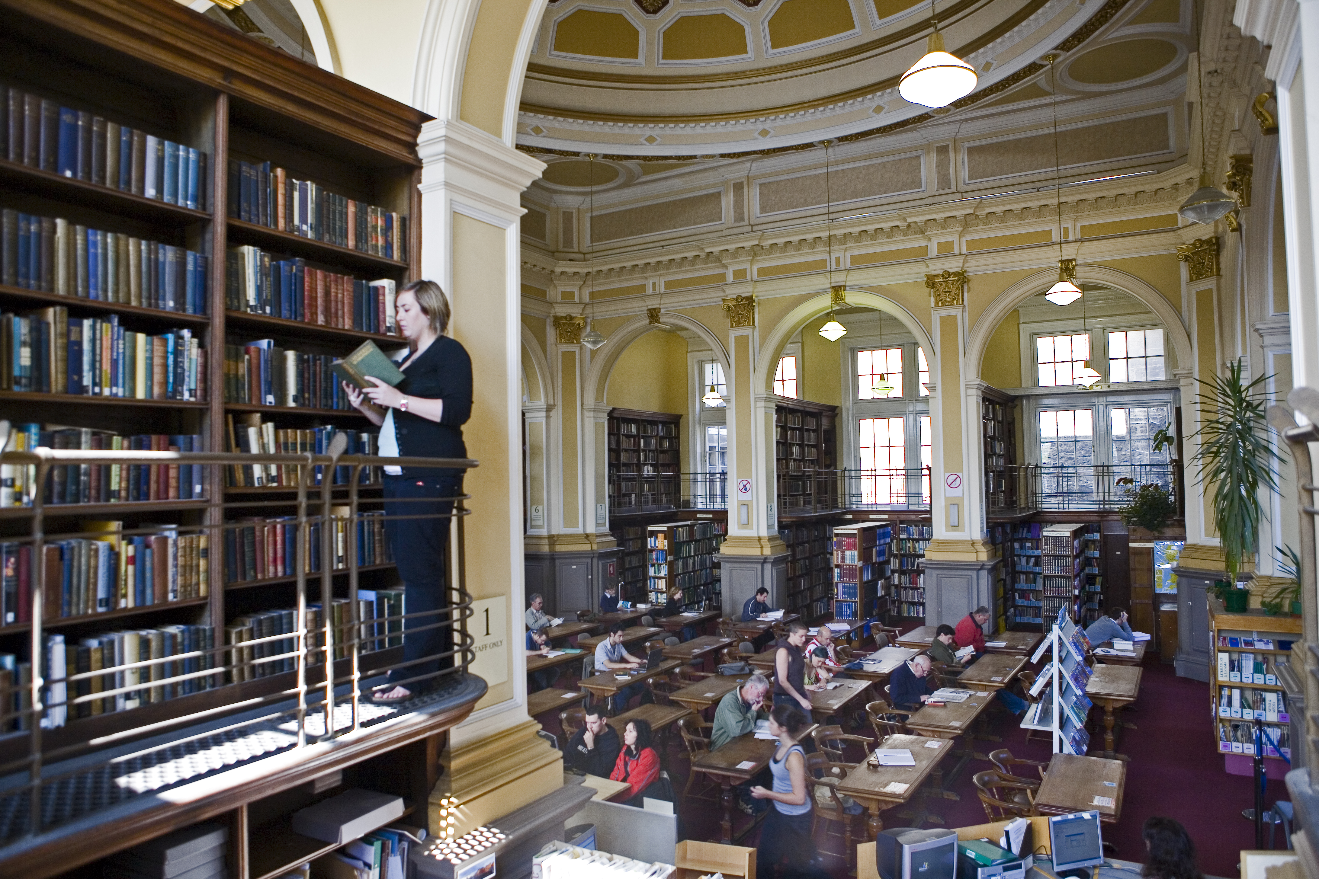
When I was at school studying for my school leaving exams we got time off to revise in the city library. In my case the Central Library on George the IV bridge in Edinburgh. A wonderful Carnegie funded edifice. In the upstairs reading room shelves and shelves of knowledge surrounded you. In reality it was a tiny slice of knowledge, not as comprehensive as what is available to us all today at any time and any place, but the experience of the library was far more impressive and humbling than typing into Google.

The librarians took pains to make sure all books were cataloged correctly and always in their right place. What I found interesting was not the subject I was meant to be studying, but the other stuff. Even when I sought out a book for my studies I was always drawn to the boundaries where one subject abutted with another. Here I could stray into new but often related worlds. Even more exciting were the miss-placed books which had escaped the librarian’s labours. Happenstance, serendipity, random, call it what you may, but these chance encounters held more interest and had the power to freshen my mind far more than the subject under study.

Teenage boredom was partly at the root of this, but in subsequent years it has been the mixing of disparate disciplines or association of separate concepts that I have found the most profitable for the generation of new ideas.   

Today I very, very rarely visit a library. Occasionally a book store and I catch glimpses of this distant excitement. Now I research and find my knowledge in the digital world. Most of our digital tools are designed to filter out what we are not interested in. We search and expect to be delivered the most relevant and informative content based on our query. We follow like minded people and they feed us articles which match our interests. Despite the internet being full of incredibly diverse information we tend to stick in one or several very small areas of interest.  Serendipity has no place in tools designed for efficiency and accuracy. Which, I think is a loss.


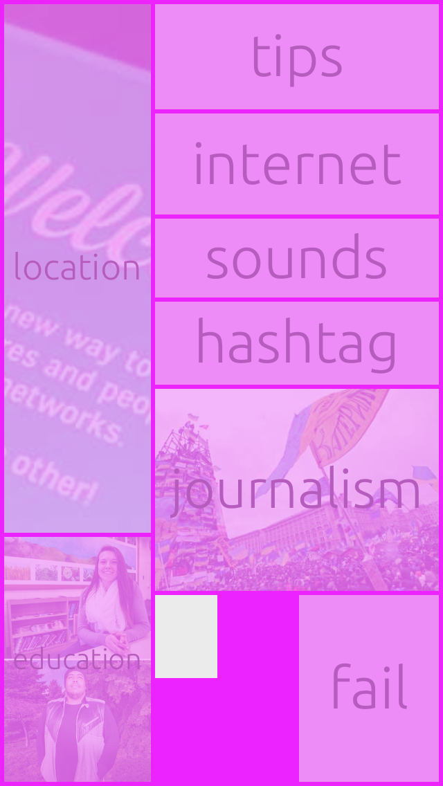
That is why I love a new app from Finish developers, Futureful . Its called Random and is currently available for IOS. It has been called an irrational browsing experience. The experience is unlike other news feeds or aggregated content delivery systems. Okay it is not completely random. But it is sometimes hard to see why subject X is with Y. The set of subjects and sub subjects you can choose from are all related, but in a more loosely and tangential way than most news feeds. I cannot tell but I think the strength of associations is built up through my and other users use of the system. I hope the evolving associations do not become too strong and it looses its diversity.


I also like the way the links are represented with just a single or couple of words. There is no indication of the source or additional information. Your interest is triggered by the words and you follow a path, the spine of the book not a preview of the content. If it is not what you are interested in you backtrack. But when you do so the link selection is refreshed with new content and a new journey opens up.


Using Random I have discovered content I would not have sought out but which I found interesting and thought provoking. Give it a go.

Enhanced by Zemanta

Wednesday, 14 August 2013

Leap Motion a flawed and isolated advance


I was one of the people who funded Leap otion on Kickstarter. I had been wowed by the potential of the product. I put my money down and waited in eager anticipation. I loved the idea of an almost magical way of interacting. I dreamt of the way it might, might, help my daughter with disabilities interact with computers. She has mastered the iPad - the biggest advances in computing for those with special needs-  and I hoped that this might provide a new way for her to use technology.

I have been using Leap Motion for over two weeks now. The best two words to sum up my experiences are, disappointed and tiring. High expectations are always hard to deliver on, but in the case of Leap Motion its biggest problem is not to do with the technology or the hardware. Granted there are only a limited number of useful applications in the Airspace store. The ones that work best, to my mind are the simple games where the accuracy of the device is not as important as the gestural interaction. When you want to really interact with your computer, when you try and use Leap Motion as a replacement for the mouse it falls down. The problem is the lack of touch. Using the device to gesture to move things around or change views is fine but if you want to select, or attempt to move items with fine control, the lack of haptic feedback is a real problem.

Selecting requires a steady hand and the need to keep it in place to indicate that the item you are pointing at is the one you want to select. This requires the unnatural behaviour of holding your hand, pointed finger very still in 3 dimensions for a few seconds. Touch based interfaces faciliate near instant selection. But more importantly they provide a surface which your finger(s) can push against and rest upon. Keeping your hand of fingers resting in thin air is very unsatisfactory. If you try and do this for anything but a short time you find gestures and selections make you arm tired. The old human computer interaction term, coined in the 80's, "Gorilla Arm" applies. This was originally used to describe the fatigue induced from extended use of vertical touch screen interfaces, but it sets in even earlier where there is no surface to resist or use to gain some support from.

So, rather than be a device I use habitually, it has already become another novelty article I pull out to briefly wow others, and then put away do real work. Another technology which fails to work for my daughter. A bold and interesting technology, but fundamentally flawed. So what is the real future of interaction? How will we interact with devices in ten, twenty years time? I suspect there will be two. One is already here and well established, the other is in its early stages.

Touch based devices will become increasingly more common. We forget that decent responsive, natural touch screens have only been in the consumer market for a few years. Prior to the first iPhone most touch screens used resistive panels as still used in some cash machines. They required you to actually register a push and only allowed single finger interaction. The iPhone brought in high resolution capacitive screen which supported multi touch.  While the technologies to deliver these intuitive experiences are several decades old, the commercial versions in smartphones are already so common they seem old hat.  Touchscreens in devices and objects will continue its rise in use against the old guard of the mouse. As tablets and internet of things devices proliferate, these will exceed those devices which still use a mouse or track pad. However despite the success of IOS and Android, touch user interfaces are still subordinate to the mouse in highly functional tools such as professional image and video editing. The mouse has been around since 1965 and still has life in it for at least another five or ten years.

Speech interaction paradigms will grow in complexity and ability to work as effective natural language interfaces. Speech input and feedback is an odd method for use in public spaces and while it possesses the potential to allow complex instructions, is useless at "house keeping" interaction. Asking a computer to move a window from one position to another or to swipe a virtual paintbrush across a screen along a given path, is not where speech input works. But instructions which contain meaning, "where is the nearest restaurant which my friends recommend", "find when my doctor can next fit me in",  "when is my current account likely to go into overdraft", are more useful scenarios. But these are not excel or word type applications. And here is the problem.

When predicting the future is that we tend to see it in terms of today's capabilities. In these predictions I am grounded in the historic models of the desktop and newer tablet application model, and the latest siri and Google now and Google glass models. As we have seen in the past, new interaction approaches often come as a part of new interaction paradigms. Command line gave way to direct interaction because of higher resolution displays, graphical interfaces and the computer mouse. Without the combination of these elements we could not have had spreadsheets or WYSIWYG word processing and later desktop publishing. At the same time it did not make command line programming impossible, just less usable and effective when compared to the new alternatives.

Until recently we interacted with computers at the desktop, they were go to devices for specific uses. The world has radically changed, we now use smart phones, tablets, connected devices, as well as the PC. New interaction models are appearing, most focusing on context.  Many contexts are focused around direction and making a computerised device provide a service in the form of information, or rudimentary functionality. Google Now is based on a lack of explicit interaction, on an anticipation model based on individual and aggregated big data. While this may work in environmental and lifestyle applications, they fail to hit the mark in productive situations where we generate new content or documents or rich creations. The traditional territory of the PC. Tablets try and provide some tools for content production, but they have yet to reach the productivity levels one can achieve with a mouse at a PC. Kinect shows how one may interact with a living room computing system. Again, applicable in one context but not another.

Leap Motion has it tough. Put aside the flaws I have already identified. Leap Motion is trying to slot into an existing system, rather than the much, much harder task of creating a complete new paradigm. It may be that my disappointment with it may stem from the fact that it does not fit, and it is unclear what the supporting technologies are required to create a new effective paradigm. One where, like the mouse,  Leap Motion is just one element. A new model where new forms of applications will be discovered which may transform our ways or working as much as spreadsheets, word processing and the like have done in the past.

Enhanced by Zemanta